We were commissioned to create the brand identity for the new Jewry Wall Museum – one of the UK’s largest surviving Roman structures. The project aims to bring Leicester’s rich Roman heritage to life through immersive storytelling, engaging interpretation, and bold, contemporary design.
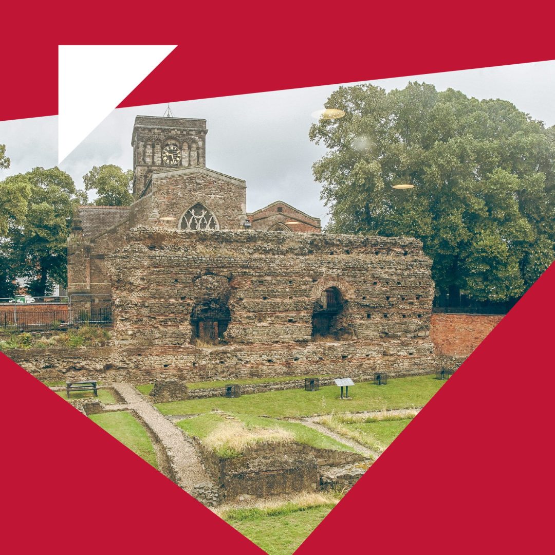
A powerful symbol of Leicester’s 2,000-year story, Jewry Wall is now home to a reimagined museum experience which reopened in 2025. As part of the wider transformation of Leicester Museums & Galleries, Arch Creative was brought in to develop a new identity for this world-class heritage site – connecting Roman history with a modern audience.
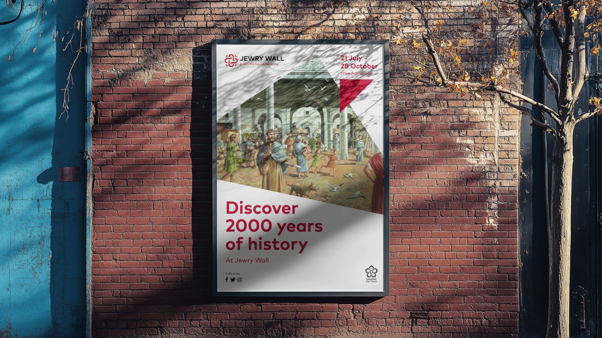
The branding needed to reflect both the gravitas of the site and the excitement of the newly redeveloped museum space – which includes fresh interpretation, family-friendly exhibits and immersive storytelling experiences.
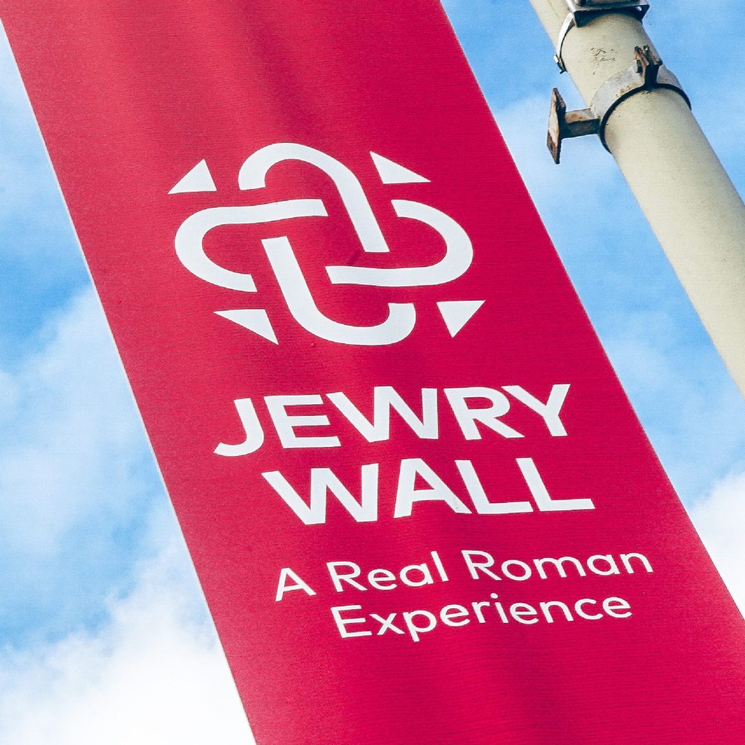
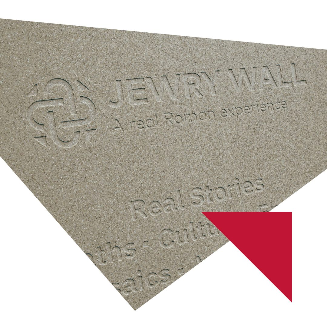
We supported the team to integrate the new tagline “A Real Roman Experience” which set the tone: direct, accessible, and rich with promise. The museum gives visitors the chance to step inside a living timeline – from ancient baths to mosaic floors – right in the heart of the city.
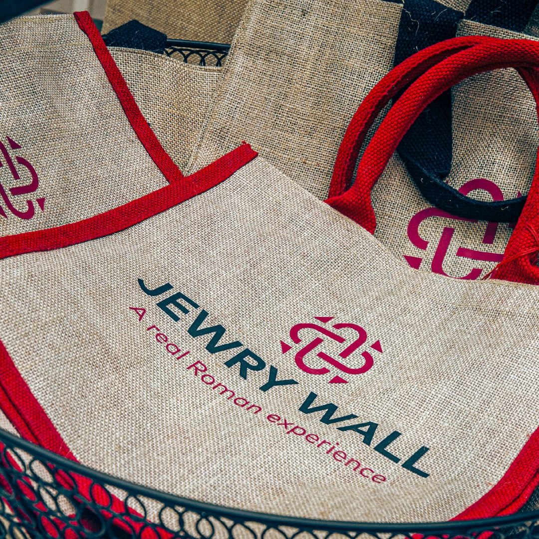
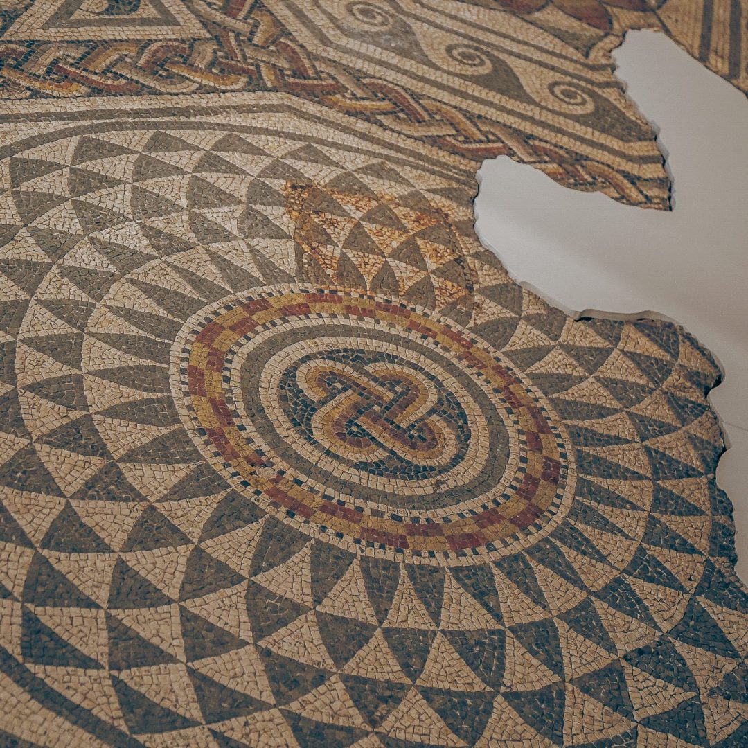
The new identity is rooted in the tiled mosaics discovered on-site- geometric shapes that speak to craft, civilisation and endurance. The icon’s distinctive four-curve formation reflects the iconic arched silhouette of the Jewry Wall, as well as the distinctive pattern from the Blackfriars mosaic which was uncovered beneath the Great Central Station, and dubbed the world’s “finest mosaic tessellation.” This connection between Roman design and modern interpretation runs throughout the brand system. In line with our wider work for Leicester Museums & Galleries, the identity uses timeless geometry, a refined colour palette and flexible layout principles to work across digital, print and environmental applications.
The rich red used throughout the identity draws from the natural tones of Roman brickwork and mosaics uncovered on-site – evoking warmth, heritage, and the enduring craftsmanship of Roman design. It also echoes the traditional colour often associated with Roman power, military uniforms, and imperial iconography. Paired with deep black, the palette introduces a sense of strength, contrast and sophistication, grounding the identity in seriousness and timelessness while allowing the red to stand out.
As part of the delivery, we created a complete brand toolkit including:
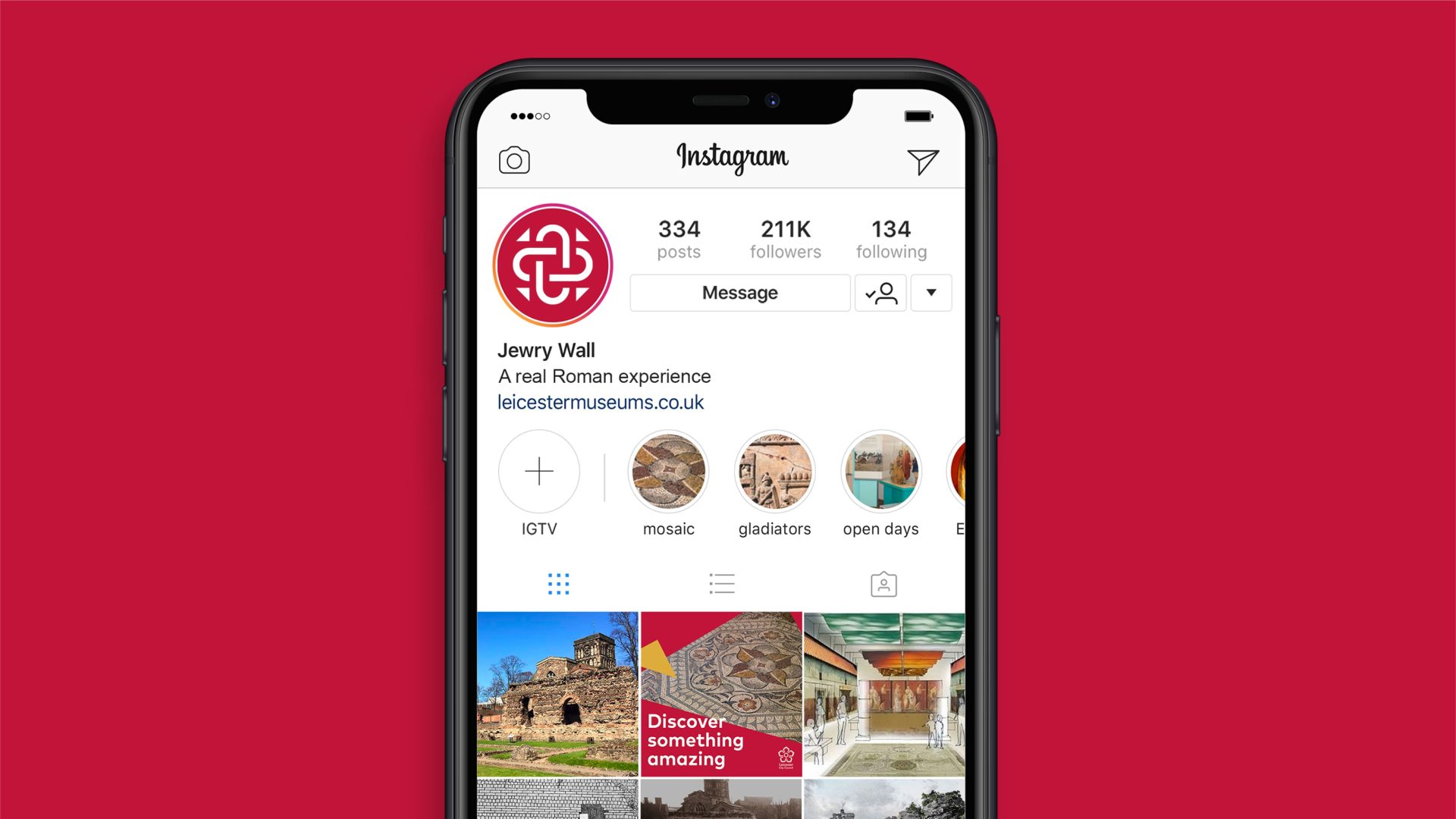
The branding ensures consistency across everything from signage and leaflets to website, campaigns and wayfinding- helping to position Jewry Wall not just as a preserved relic, but as a living, breathing part of Leicester’s story.