
Leicester Restaurant Week
Creative, paid social and influencer marketing on the menu for Leicester Restaurant Week.
The Goodwood Estate in Chichester has been owned and operated by the family of the Duke of Richmond and Gordon for over 300 years.
Every generation brings something new to the estate, and in the modern era, the Duke has transformed Goodwood into a mini town based on sports and leisure. Luckily for us, the Duke and his team also appreciate the power of branding.
Famed for its motorsports and horse racing, Goodwood welcomes hundreds of thousands of guests every year – and those guests get hungry. Arch Creative were approached by Goodwood to develop six distinct brands for the variety of concessions offered to the estate’s visitors.
We were commissioned by Goodwood Estate to create six distinct and fully-fleshed brand identities, each one bespoke, for the different food and drink concessions operating across the estate. For each concession, we needed to reflect the style and personality of the food offering, while ensuring the brands also felt like part of Goodwood’s wider leisure-led identity.
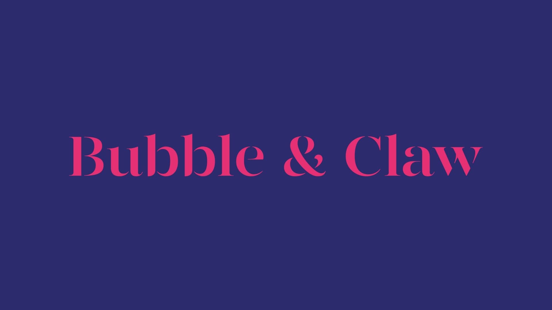
Serving the best lobster and champagne, Bubble & Claw is the epitome of food at Goodwood. Our branding captured the elegance of the food they serve, whilst paying homage to its nautical source. A colour palette of deep navy and quirky magenta reflects a sense of history and tradition mixed with modern eccentricity – the perfect blend for the brand.
A repeating pattern based on the mesh of a lobster trap runs through the branding, whilst the central image is a crosshatch-style, anatomical drawing of a lobster. Our chosen font brings to mind high-class eateries – simple, smart and elegant.
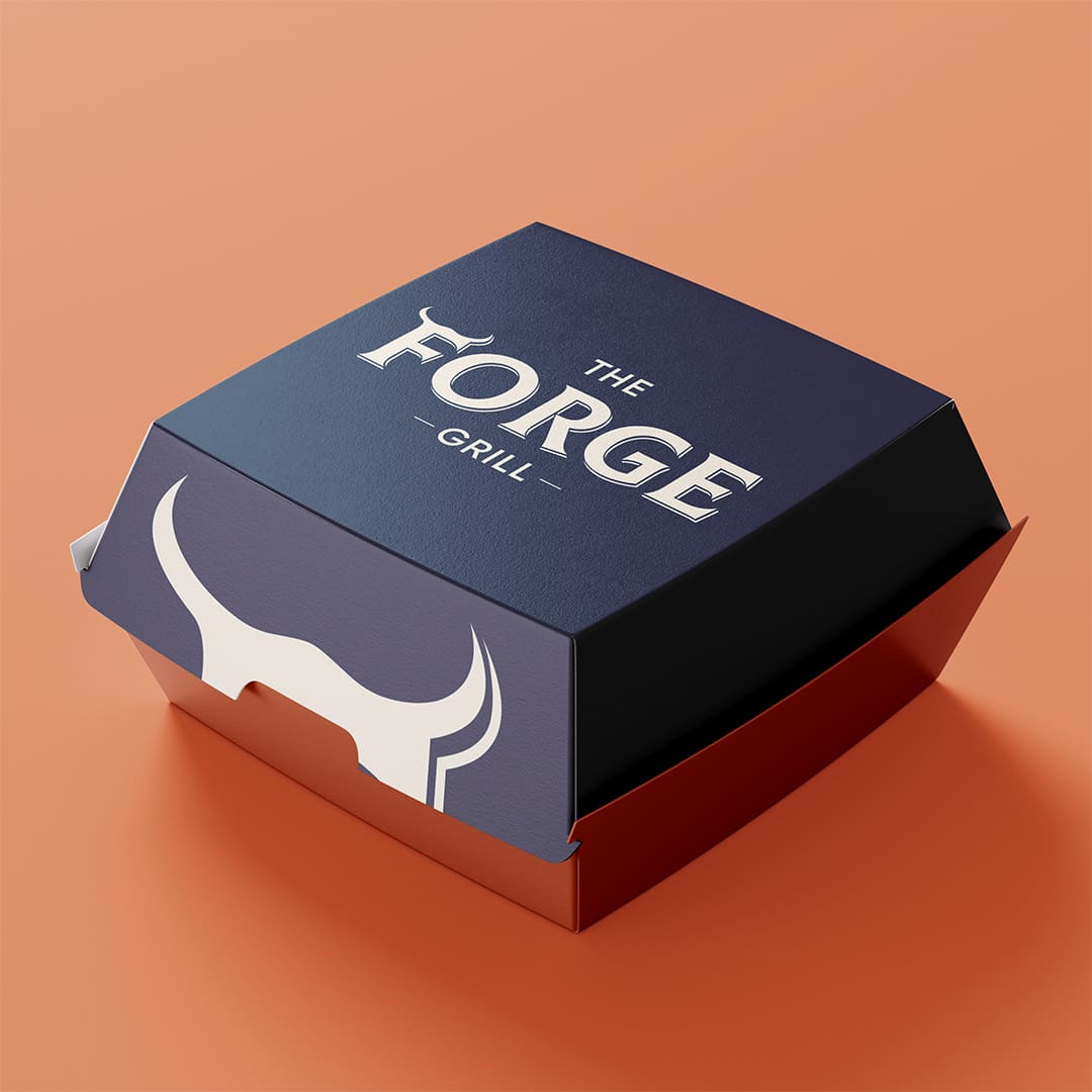
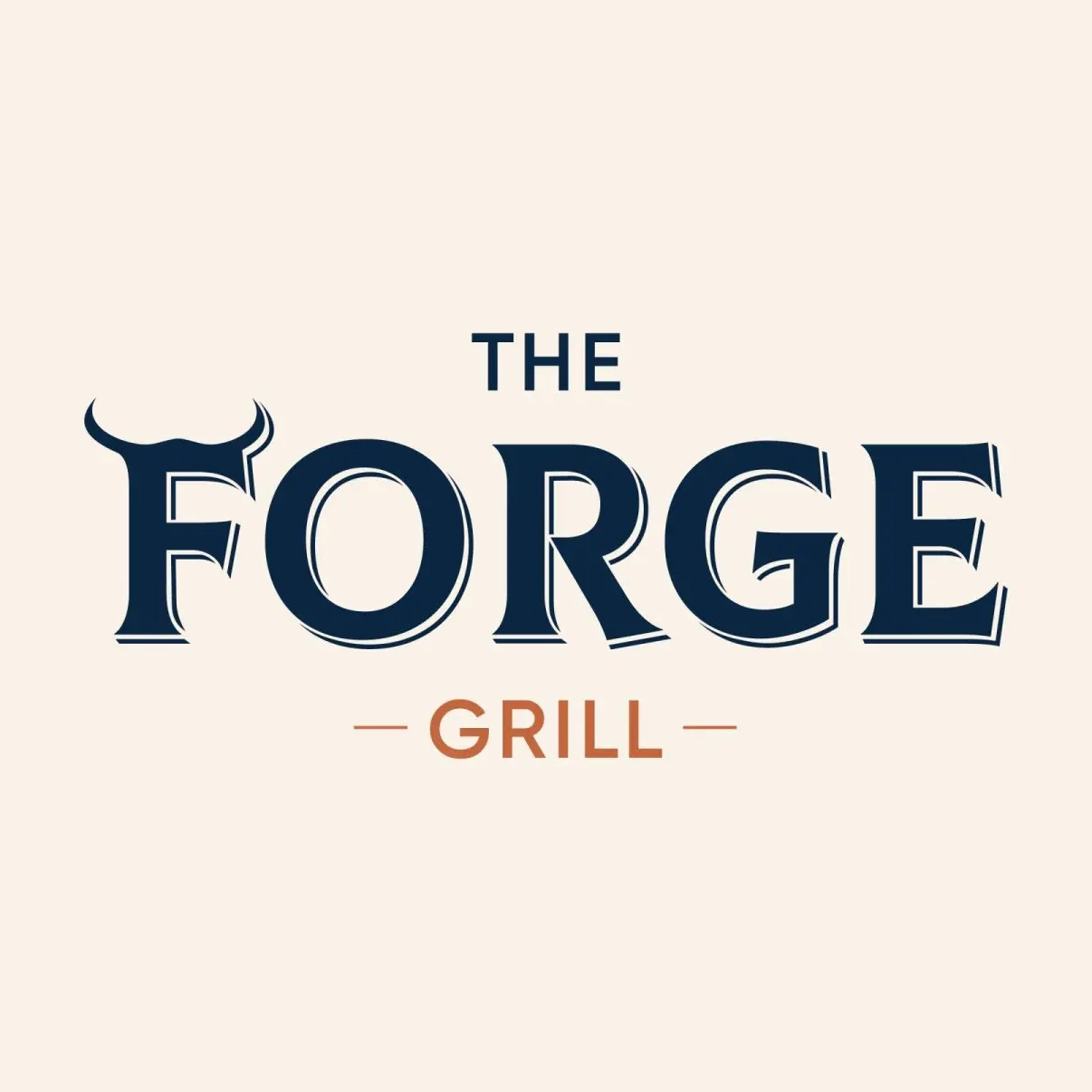
The Forge Grill is exactly what its name suggests: a dedicated grill house with a focus on high-quality burgers. We created a signature icon featuring a capital ‘F’ formed with subtle horn details. This horned mark evokes several ideas at once: the heat and intensity of the grill, a hint of fiery character, and the strength of a prize bull – all referencing the premium beef at the heart of The Forge’s menu.
The overall logo has the feel of a traditional cattle brand, reinforcing the connection to exceptional beef and craftsmanship. It translates beautifully across applications, whether carved into wood, burned into materials, or printed across menus and signage. The result is a brand that feels authentic to the culture of the grill, yet still carries the elevated quality expected of a Goodwood concession.
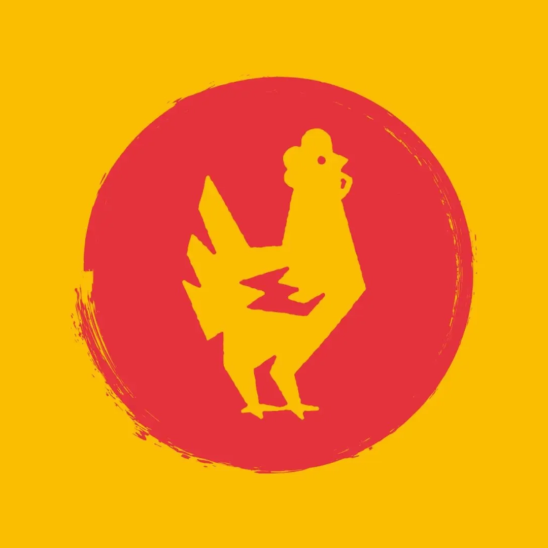
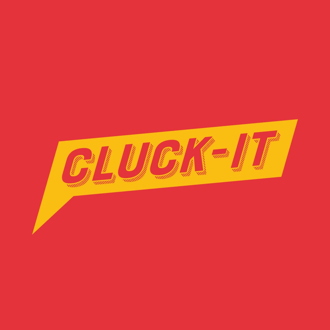
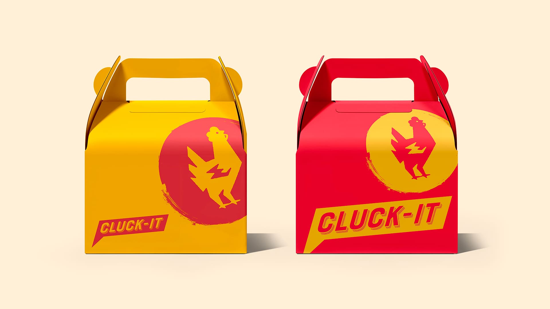
Using a pop-art–inspired speech bubble and a sharply stylised chicken icon, we developed a brand identity for Cluck-It that plays confidently into its risqué name. The bold red and yellow palette nods to classic fast-food restaurants while giving the impression that the Cluck-It logomark could easily belong to a chicken-themed superhero.
The character of the brand comes through before you’ve even glanced at the menu. It sets clear expectations and communicates its offer through its visual identity alone: you’re here for street-food-style chicken burgers and wings, served with playful energy.
Inspired by the indie coffee shop aesthetic found in London and New York, Café March appeals to caffeine lovers before they’ve even caught the aroma of freshly ground beans. Its printed-style logotype lends the brand an authentic, artisanal quality that resonates with those who take their coffee seriously.
The simplicity of the black-and-white palette reinforces a clear brand message: this is coffee made exactly as you like it: straightforward, unfussy, and without judgement. It signals efficiency without compromising flavour, assuring customers that their coffee will arrive quickly and taste exceptional.

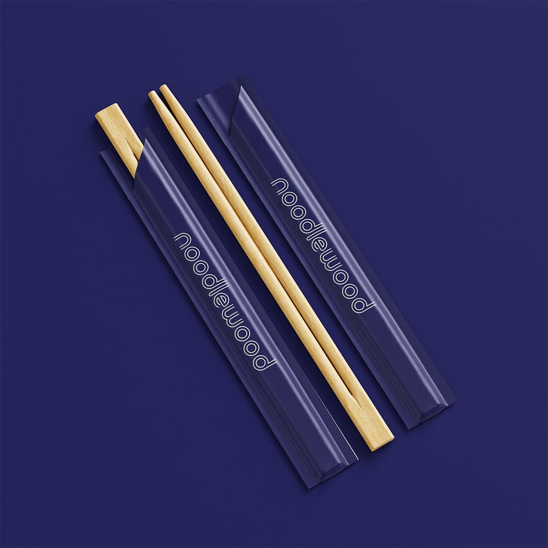
Who doesn’t love noodles? Noodlewood draws inspiration from traditional Japanese art combined with the sleek, neon-lit simplicity of modern Tokyo, creating a brand that feels appetising even before the first bite.
The typography and accompanying brand pattern bring to mind the swirling shapes of the noodles themselves, while maintaining a clean design that is visually engaging.
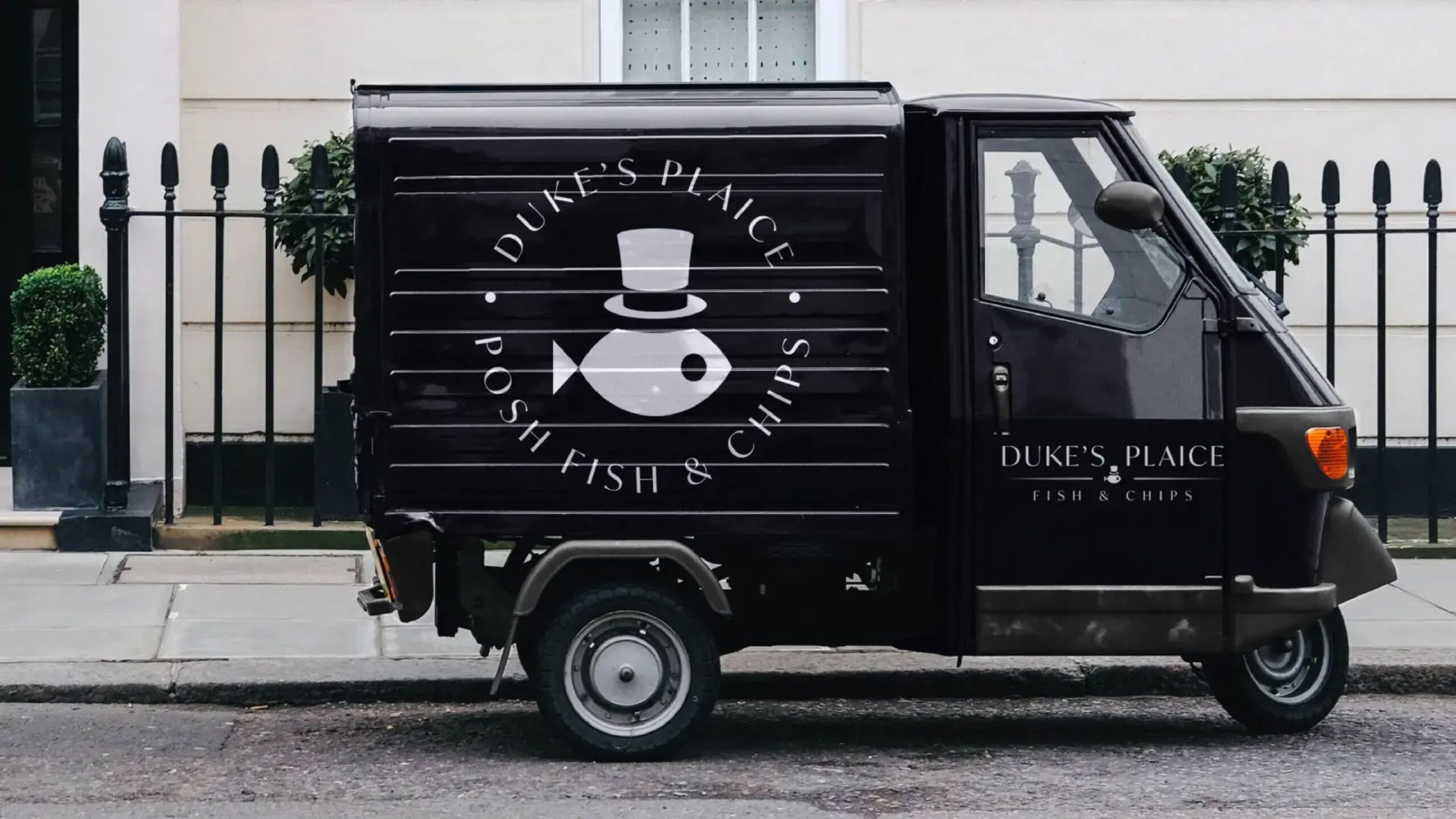
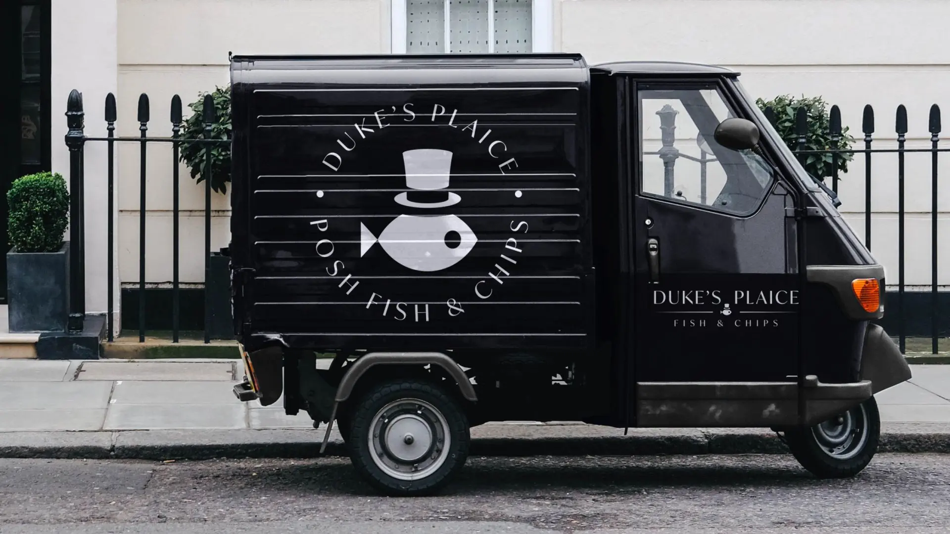
How do you signal that a traditional fish-and-chip shop is upmarket? At Duke’s Plaice, we did it with a little humour, by placing a fish in a hat within the logo. The brand needed imagery and typography that reflected the clever pun in its name while conveying that this is no ordinary chippy.
A subtly serifed logotype paired with the charming fish icon strikes the perfect balance, blending warmth and personality with a sense of quality. The result is a brand that balances the playful and premium aspects of the restaurant seamlessly.
Creative, paid social and influencer marketing on the menu for Leicester Restaurant Week.

A modern, forward-thinking identity for a finance company that champions innovation and stability.
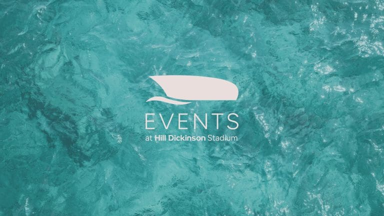
Delivering world-class hospitality experiences at Hill Dickinson Stadium.
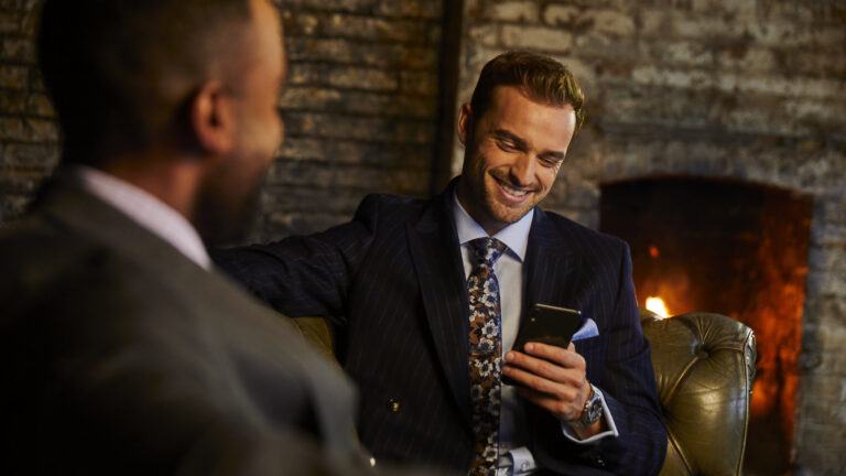
Capturing brand stories through lifestyle photography.